ABOUT DANIELLE FOUSHEE

I am an artist. This website features my work and highlights some of the varied
inspirations that inform my creative practice. Read more about me here.

Check out my facebook page or follow me on twitter at
@ArtistDFoushee.

Tuesday, November 23, 2010

Alternative Materials for Creating Self Portraits

Zack

I wanted to take the pressure off my drawing students before the Thanksgiving holiday. I asked them to bring in a variety of alternative materials with which they could create mixed-media self portraits. They brought tape, fabric, cotton balls, string, popcorn, sunflower seeds, aluminum foil, peanut butter, and so much more.

 
Sylvia

The students piled all their materials in the middle of the room. It was a free-for-all as they vied for materials they wanted for their collages. I told them the self portraits could be as abstract as they wanted—they didn’t need to be a realistic representation of their faces... I’m much more interested in the inventive use of the available materials. I hope they enjoyed this opportunity to just play, without worrying about making things look “perfect.”

Me

I was so inspired by the materials everyone brought in that I decided to make my own self portrait (above). My favorite part is the spaghetti hair and the knot for the nose. It turned out a little bit scary, but I had fun letting go for a day!

Sunday, November 21, 2010

The Art of the Still Life

In-class drawing by Brenden Nelson

My drawing students have been focusing on still life drawing for the past couple weeks. We have spent quite a bit of time talking about symbolism, narrative, and meaning that is wrapped up in the selection and placement of objects.

Paul Cezanne’s Still Life with Skull

I showed them examples of still life art (both painting and sculpture) that gave me pause, then asked them to find their own examples to analyze. I never really appreciated still life art until I began to research it for this class/assignment. I felt that the work was usually a bit static... But when I looked closer I was able to see beauty in the layers of meaning, the open-ended storytelling, and the moral themes that are often conveyed.

 Hyperbolic Crochet Coral Reef, Christine Wertheim & Margaret Wertheim

Saturday, November 13, 2010

Intertwining Strands of Something . . . / No. 1

 
Intertwining Strands of Something ... (1a). 6x6 inches. 2010

I’ve been working on a new series of paintings using these intertwining pearl-like strands that weave and curl around each other over an atmospheric background. I think there’s a meditative quality about them, something peaceful, contemplative.

 
Intertwining Strands of Something ... (1b). 6x6 inches. 2010

My yoga practice is often a strong inspiration for my artwork, even though the specific connection isn’t always planned out ahead of time. Yoga allows its practitioners to connect with and gain knowledge about the innermost (and interconnected) workings of their minds and bodies.
“The central doctrine of Yoga philosophy is that nothing exists beyond the mind and its consciousness, which is the only ultimate reality. The objective of this philosophy is to uproot misconceptions about the existence of external `realities` from the minds of men. It believes that it is possible to reach this stage of self realization through regular practice of certain yogic meditative processes that bring a complete withdrawal or detachment from all false sources of knowledge and inculcates an inner sense of balanced calm and tranquility.” —Life Positive magazine
Intertwining Strands of Something ... (1c). 6x6 inches. 2010

These three little paintings work as individual pieces, but they seem to embody a little more meaning when seen as a triptych. The intertwining strands connect when the pieces are placed side by side, perhaps implying an abstract narrative of a moving spirit transported through time.

Intertwining Strands of Something ... (01/Triptych).
6x18 inches. 2010
Click on this image to see the whole triptych up close.

More images in this series to come...

Monday, November 8, 2010

Deborah Jane Batt’s Abstract Communities


I just came across these paintings by Deborah Jane Batt today. I love the colors and compositions. They connote the idea of aerial landscapes (which I’ve mentioned before here, here, and here). I’m drawn to the graphic quality of maps and aerial photographs, and these paintings add another layer of whimsy and color to the subject.


Ms. Batt says of her work: “Although my paintings have become increasingly non-objective over the years, all my work still originates from the idea of community, the towns we build, and the way we shape and destroy the rural landscape.”

I love that the shapes in these paintings are slightly off, imperfect rectangles. In my own work I struggle with never being able to achieve the level of precision that I want. But when I see how beautiful flaws can be (in art and in life), I’m reminded that it is in those moments of imperfection that we find the humanity in our work.


I wonder if the quiet beauty of the rural landscapes Ms. Batt depicts is too harmonious to clearly convey the destruction she points out in her statement—or maybe I have latched too tightly onto this conflict. I do love to see strong contrast within works of art. These contradictions are what makes some artists’ work so memorable, and I know from experience that it’s not an easy balance to achieve.

Thursday, November 4, 2010

Fresh Out of the Studio: Meditations on Samskara

Samskara (study 01). 13x10 inches. 2010.

Lately I’ve been exploring the idea of chance encounters and controlled responses... I’m fascinated by the way in which the human condition (both on the macro level of a larger culture and at the micro level of the individual) is basically characterized by habitual responses to various unpredictable situations. We tend to live in a state of inertia until some cathartic event causes us to change our path, usually for only a short time. At some point when we’re not paying attention, we tend to revert to our old way of doing things.

According to yogic philosophy, this repetitious cycle of behaviors (called samskara) is caused by the karma we’ve created for ourselves. We must necessarily continue in this Groundhog Day scenario until we finally learn the lessons that bring about lasting positive change.

Samskara (study 02). 13x10 inches. 2010.

These new paintings are my first attempt to convey the process of releasing karma — not from a judgmental point of view — but more from an observational standpoint. Perhaps it is an illustration of the constant trial and error we all experience through the waves of life and the occasional breakthrough to something more free, more creative, and more aware.

These paintings are the small sketches (the ones that fit on my scanner)... I have some bigger ones in process that I’ll post eventually... when I finally get my stuff over to the photographer. (He gives me a discount when I have a bigger batch of stuff to shoot, so I need to keep making more stuff!)

Wednesday, November 3, 2010

More Student Drawings


I think perhaps the only way to improve your drawing skills is to keep practicing, so that’s what my beginning drawing class does (in one way or another) each week — exploring various techniques and adjusting in areas of weakness after a critique.


One week the students practiced drawing each others’ hands in different positions. Another week the students practiced figurative gesture drawings as an initial sketch (see their first attempts at gesture drawing here). Then they came back in on top of these quick gesture drawings to add shading and detail.


I’m still dumbfounded at how quickly the students’ work has changed and improved over the course of the semester. Many of these students had never taken a drawing class (or any kind of art class) before now.


I’m scheduled to teach drawing again next semester, and I already have a number of ideas on how to improve the sequencing and hierarchy of the assignments. I appreciate having the opportunity to teach the same class over several semesters because then I have a chance to incorporate the things I’ve learned through each unique experience with students.

Tuesday, November 2, 2010

Josef Albers: Favorite Famous Artists / Part 3

Homage to the Square

I was first introduced to artist Josef Albers as a design student studying color theory. His book Interaction of Color influenced the way I’ve understood color ever since. A couple of quotes from the book’s introduction seem particularly poignant, at least for my own art-making practice. The quotes reproduced below use the same line breaks found in the book.

Homage to the Square

“In visual perception a color is almost never seen as it really is
—as it physically is.
This fact makes color the most relative medium in art.”

This image from Interaction of Color illustrates the illusions that occur when the same color is placed on different backgrounds.

Albers also says: 
“First, it should be learned that one and the same color evokes
innumerable readings.
Instead of mechanically applying or merely implying laws and rules
of color harmony, distinct color effects are produced
—through recognition of the interaction of color—
by making, for instance,
2 very different colors look alike, or nearly alike.”

Saturday, October 30, 2010

Native American Ruins in Road Canyon on Cedar Mesa, Utah

The Citadel is out this finger in Road Cyn

Matt and I spent another weekend exploring Cedar Mesa before winter sets in. We spent the night on the rim of Road Canyon, and then hiked out to The Citadel under a royal blue sky and perfect temps. The Citadel is perfectly situated at the end of this skinny ridge in a defensive position. Residents could see 360° from their location, and would have known if any visitors were approaching.

The Citadel, exterior view

According to scholars Jonathan Till and Winston Hurst, the Anasazi (ancestral Pueblo) lived in the canyons around Cedar Mesa in southeast Utah for over 2,000 years. They finally left for good around 1200 A.D. Today, visitors can still find cliff dwellings, artifacts, rock drawings, and granaries left by the people of the past. We left everything exactly as we found it (and kept our dog away from the ruins) to protect these amazing resources for future visitors.

The Citadel, interior view 
(I didn’t go inside, just stuck my arm inside the door with my camera.)

Mojo taking a drink from a slick rock puddle.

Monday, October 25, 2010

Students Draw “Art on the Corner”


Recently, I was invited to join the Downtown Grand Junction Art on the Corner Committee. Art on the Corner is a local public art program that supports the work of sculptors with exhibits along Main Street and at other public landmarks (like the Western Colorado Botanical Gardens). As a committee member, I will be helping to develop and promote public art exhibits and cultural events in the city.


After being asked to be on the committee, my first thought was to introduce my beginning drawing class to the Art on the Corner program. I asked the students to visit downtown Grand Junction and practice their skills by drawing the sculptures on display. Here are a few examples of the their work... Not bad, if I do say so myself!

Sunday, October 24, 2010

Colorful Installations by Megan Geckler

Spread the ashes of the colors, Wexner Center for the Arts, 2010

I came across Megan Geckler’s work the other day on Facebook (we must have mutual friends)... and was stunned by its simplicity and graphic beauty.

 Spread the ashes of the colors, Wexner Center for the Arts, 2010

She creates site-specific installations using translucent surveyor’s tape in various colors. The repetition of linear form within room(s) creates smaller spaces of many shapes within larger architectural spaces. The translucency of the tape and the empty spaces between strands of the tape control our ability to see from one space into the next — sometimes spaces are more open, other times they're more closed off. I love this play between openness and secrecy, and the super-saturated color is both enticing and sickening (like eating too much candy).

 Spread the ashes of the colors, Wexner Center for the Arts, 2010

Her work is on view now through February 2011 at Wexner Center for the Arts in Columbus, Ohio. She also has a piece on display at the Pasadena Museum of California Art through October 31, 2010. I wish I could be there to see these pieces in person!

Sunday, October 17, 2010

New Work: Little Ink Paintings

 
Untitled. 6x4 inches. Ink on paper. 2010.

I’ve been sketching with some new inks that arrived this week. Check out these quick little paintings. I’ve got some bigger paintings in progress so check back often to see my newest work.

 
Untitled. 6x4 inches. Ink on paper. 2010.

 
Untitled. 6x4 inches. Ink on paper. 2010.

Wednesday, October 13, 2010

Alphabet Design (In Progress)

 
Alphabet (unfinished)

Last year I designed a custom logotype for FIDM’s acronym (see below) on a poster project. Now, I’m about to start a new FIDM college viewbook design. So, I’ve been thinking about using the forms I created last year as a starting point for a whole new display typeface that I can use throughout the new student viewbook.

 
Last summer’s FIDM Poster

This alphabet is still in progress, but I think you can get a sense of where I’m going with it. One of the perameters I set for myself is that this typeface will be a monoline, which presents some special challenges in the design. I’m trying to come up with solutions for the quirky counter spaces and bowls in the “e” and “s”. I’m not too excited about raising the x-height, and the only other option I can see offhand is to decrease the weight overall.

lower-case word test

And then I suppose eventually there should be numerals and punctuation. Check back soon to see how it turns out...

Saturday, October 9, 2010

Watching Paint Dry

Wet Ink (detail)

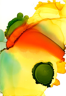
I’ve been working on a new painting today... I love the the process of this technique (although it is a test in patience!). Watching the ink dry is actually an amazing metamorphosis. Someday I would like to videotape the process, and play it back in ultra slow motion HD (a la Bill Viola). When I apply the ink, the colors bleed into each other. It shifts and moves as it dries over time. 
This piece took about an hour to dry completely... Both images are details from the same painting. The first photo was taken when the ink was initially applied, the second was taken about 40 minutes later.

 
Dry Ink (detail)

By the time the ink dries, it looks totally different than when I first applied it. I can’t precisely control the way the colors combine. I can influence how the ink runs across the page, but the end product is largely determined by chance. I have a few additional layers to add to this piece before it’s finished. Stay tuned...!


Wednesday, October 6, 2010

Cy Twombly: Favorite Famous Artists / Part 2

Untitled VII from Bacchus Series

I found out about Cy Twombly when I was a high school student at University of North Carolina School of the Arts. My drawing teacher, Clyde Fowler, liked Abstract Expressionism as a way to teach us about a variety of mark-making techniques.

 
Lepanto

It was Cy Twombly’s work that first showed me that drawing and painting doesn’t always have to be a perfect, representational rendering of a person or object. Drawing could be abstract, emotional, and alive!

Wilder Show of Love

And, of course, as an artist and graphic designer, I’ve always been fascinated by the use of language (or hints at language and writing) in visual creative expression. I have never understood those people who argue that fine art (painting, sculpture, etc.) shouldn’t need words. . . I don’t think they are always necessary, but sometimes a few choice words can push a piece quite to the edge of meaning, other times can make a work more concise and pointed (see my post on Barbara Kruger).

Untitled

Sunday, October 3, 2010

Autumn in the San Juan Mountains

West Fork, Delores River, San Juan National Forest
Photo by Matt McGrath

Matt and I decided to make one last trip to the San Juan Mountains south of Telluride, Colorado before the cold weather sets in for winter. We had a great weekend camping camping and hiking in the San Juan National Forest.

Colorado Hwy 145 from the Calico National Recreation Trail

On Saturday, we day-hiked Priest Gulch cutoff of the Calico National Recreation Trail. The weather was perfect, and we were lucky enough to catch the tail end of the fall color. After the hike, we drove along the West Fork of the Delores River towards Dunton, Colorado.

Aspen Trees Changing Color on the Road to Dunton, Colorado
Photo by Matt McGrath

On Sunday, we hiked up to Lake Hope in the Uncompahgre National Forest. The views of Trout Lake from above were incredible. 

The View Down-valley to Trout Lake from the Lake Hope Trail.

View from the Lake Hope Trail.