|
Showing posts with label Design. Show all posts
Showing posts with label Design. Show all posts
Sunday, May 25, 2014
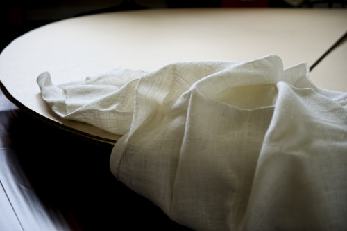
The Base for My Upcoming Installation: A New Drawing Device
Saturday, February 22, 2014
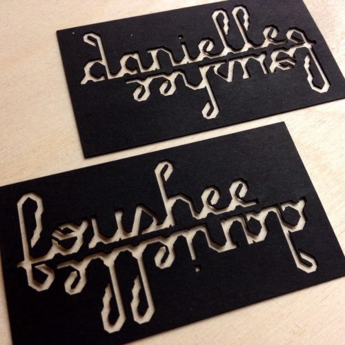
Learning the Laser Cutter
| |||||||||||||
Wednesday, February 19, 2014
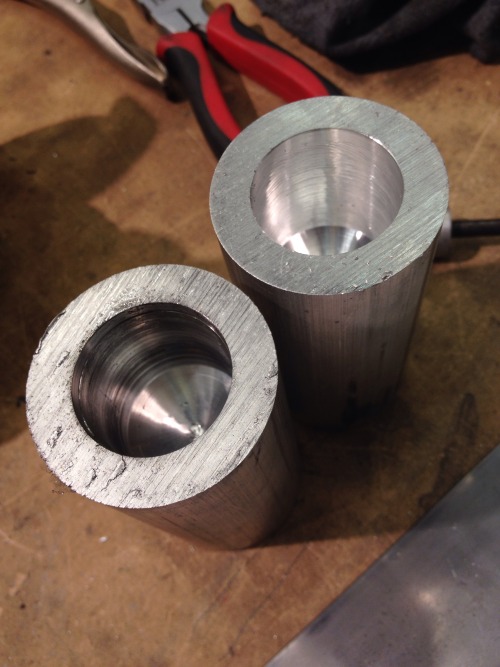
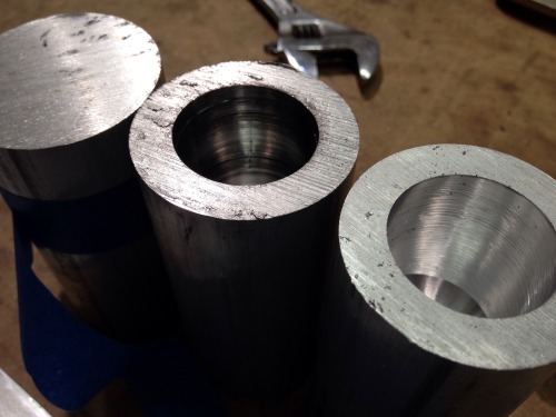
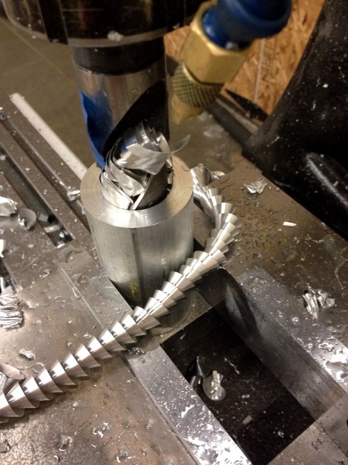
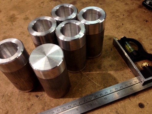
Loving the Metal Shop!
| |||||||||||||||
Friday, June 7, 2013
FIDM Poster: Finally, a Solution!

Thank goodness the clients finally let go of that brain concept. It didn’t have anything to do with fashion, but they kept pushing me to work with it. Someone on the team finally came to their senses and said that the brain looked like a psychology textbook. Indeed. I guess I had to go through all those variations before they could see it for what it was. This colorful, abstract textile is so much more representative of FIDM. I’m so glad we finally got a solution everyone could agree on!
Wednesday, May 29, 2013
FIDM Poster: Even more options

FIDM is an interesting client. I love the fact that they have a collaborative process. There are lots of opportunities to explore a range of different concepts, and just about everyone gets a vote on how things play out. On the other hand, sometimes it can feel like a project is going to drag on forever!

These are yet two more concepts for this summer’s promo poster. Hopefully I’ll get a decision on something this week!
Friday, April 5, 2013
Beginning Design Students: Gift Cards

Isabella Setina
My beginning design students did some great work last quarter!
Most of my students last quarter were freshmen, taking their first ever graphic design class. We studied all the basics: composition, color, and vocabulary. I taught them technical stuff in Illustrator. We spent a lot of time looking at graphic designs from the world, critiquing them, and talking about audience.

Ashley Piper
For the final project, I asked them to design a series of gift cards for a favorite place. The cards had to fit together as a group, but also work independently for different purposes and/or audiences. These are two of the best examples from their work... not bad!
Thursday, March 21, 2013
FIDM Poster: 2 More Concepts

I’m still working on ideas for the FIDM summer poster. The one above is a retro theme, taking cues from the popularity of Mad Men fashion and paper dolls. I really like this one... It's simpler, clearer, and more inviting, I think, than the others.

Friday, March 8, 2013
FIDM Poster: It’s that Time of Year Again

Almost every year, I get a chance to come up with new ideas for FIDM’s promo campaign. I just started working on some new concepts for a poster. I’m so glad to work in a completely different vein this year; we’re moving away from all the organic shapes and free-form designs toward something more structured and rigorous.

These two concepts are variations on the continuum from carefree to sophisticated — the top being more serious, the bottom one more fun. I’ll be curious to see what the client is drawn to. I like the top one better, personally, but I may have swung the pendulum too far in the other direction on it. We’ll see what happens!
Wednesday, November 14, 2012
Urban Posters for 8 Limbs Yoga

The poster, on a light pole in the
Capitol Hill neighborhood of Seattle.
Lately, I’ve been doing some work for 8 Limbs Yoga Centers, with four yoga studios in Seattle. The 8 Limbs, 8 Reasons campaign has been a lot of fun to work on; it’s unique and eye-catching!

The poster, as designed.
I wanted to create something simple, with giant, bold typography that will grab attention in every format.

An advertisement for The Stranger,
an alternative newspaper in Seattle.
Here, I mixed up the color palette a bit for different media, while keeping the same basic composition and style for brand recognition.
Saturday, October 6, 2012
Retreat Posters for 8 Limbs Yoga

I’m working on a new poster design for 8 Limbs Yoga Centers in Seattle, to promote their retreats in 2013. These are two visuals I’m working with at the moment.

Since the posters will be seen inside their yoga studios, I think students don’t need to see images of people doing yoga poses. Instead, I'm focusing on a relaxation & rejuvenation in nature theme, since all the retreats are held in beautiful natural settings.
Friday, June 15, 2012
Logo Concepts for a New Yoga Studio

I’m excited to be working on a new identity project for a small yoga and wellness studio that is about to open in Mukilteo, Washington, called Nanda (translation: “Joy” in Sanskrit).


My client gave me some images that inspire her, including the Fibionacci spiral, which fed several of these logo ideas. This one is youthful and fun!


I love different aspects of all of these concepts. I’m eager to find out which one inspires my client the most.
Wednesday, May 30, 2012
Preview of a New FIDM Poster

I’m designing this year’s new FIDM poster now... I’m really excited about the concept I created with my colleague Kimberley Askew. We plan to develop an entire integrated campaign in print and online. The posters will be seen in high schools around the country.
Four real FIDM students will be featured throughout the campaign, which will drive our audience to a blog where the students will chronicle their experiences as part of the creative community at FIDM. Our audience wants to be able to imagine themselves at FIDM before they apply for admission, and this is the perfect way for them to see what campus life is like from their own peers.
Thursday, May 3, 2012
Fabriano Features My Paintings

A few months ago, paper maker Fabriano purchased images of several of my paintings to include in their new paper sample books. I just got my copies in the mail today; they look great!
Graphic designers use these books to spec paper for their large press projects. The sample books show designers the best of what the papers can do with printing effects and inks.
What I love most about this piece is that it combines two of my favorite things—painting and printing.
I am humbled and full of gratitude that these Italian designers (a) found my work, and (b) appreciated its quality and ability to communicate the best of what their papers can handle.
Tuesday, January 24, 2012
Handmade Typography Underway

I’m working on a new poster for FIDM's summer scholarship promotion. I’m already excited about the direction it’s going! I’m planning to focus on ideas of authenticity/artificiality, natural/unnatural, handmade/digital.
This is a hint, more to come in a few weeks... I have lots of handwork to do in the meantime!
Monday, January 16, 2012
Logotype Concepts for FIDM

I’m working on a new logotype for a program offered by FIDM to help it’s faculty keep their skills up to date. These are three options I’ve come up with so far.
I like this purple one the best so far. I can see ways that it can be expanded into a whole system of logotypes for various sub-programs within the FIDM brand.

Monday, June 20, 2011
Design In Progress: FIDM View Book

I’ve been working on a new college view book for the Fashion Institute of Design & Merchandising. It’s about 64 pages, and will include lots of information for students on life at FIDM. These are two of the cover concepts I’ve been working on. The text is being tweaked now, so the interior pages are still in progress. I think this view book will be a nice snapshot of what it’s like to be a student on campus. When we finish this one, we’ll start working on the second view book in the series, which will focus on the exciting careers of FIDM graduates.
See more of my design work for FIDM here.

Thursday, June 16, 2011
New Designs: Ute Learning Garden

Several months ago, I finished working on a project to create seven interpretive signs for the new Ute Learning Garden at the Mesa County Fairgrounds in western Colorado. I worked with the Bureau of Land Management, the US Forest Service, and Colorado State University Extension to complete the project.

I really enjoyed working on this project, and learned a lot about how Native Americans lived on the land before they were pushed out by white settlers.
My only regret is that I didn’t have a voice in creating the posts that the signs were eventually mounted on. I probably would’ve chosen something a little more substantial weight-wise and painted them darker colors that aren’t as distracting. But overall, I think the signs themselves look great! I’m looking forward to the completion of the garden. Hopefully then they will invite me to help them unify everything graphically throughout the entire exhibit.
I’d love to have more opportunities in the future to work with educators to create interpretive displays for the public.
Tuesday, November 30, 2010
Happy Hand-Drawn Meditations

When I have a few minutes here or there, I like to doodle in my sketchbook with some tracing paper. Some of the doodles turn into nice little drawings that make me happy!

These patterns were drawn in layers and then reconstructed in Photoshop, allowing me to adjust and recombine colors on a whim...

My friend Tony Toven at Clear Image Printing Company in Los Angeles generously printed my handmade patterns onto blank note cards. I packaged them up into sets so I can give them away to clients and friends.


Wednesday, October 13, 2010
Alphabet Design (In Progress)

Alphabet (unfinished)
Last year I designed a custom logotype for FIDM’s acronym (see below) on a poster project. Now, I’m about to start a new FIDM college viewbook design. So, I’ve been thinking about using the forms I created last year as a starting point for a whole new display typeface that I can use throughout the new student viewbook.

Last summer’s FIDM Poster
This alphabet is still in progress, but I think you can get a sense of where I’m going with it. One of the perameters I set for myself is that this typeface will be a monoline, which presents some special challenges in the design. I’m trying to come up with solutions for the quirky counter spaces and bowls in the “e” and “s”. I’m not too excited about raising the x-height, and the only other option I can see offhand is to decrease the weight overall.

lower-case word test
And then I suppose eventually there should be numerals and punctuation. Check back soon to see how it turns out...
Subscribe to:
Posts (Atom)